Sunday, 6 June 2010

Ninjas! Final + Other Projects

Long time waiting for this post, been a bit busy with crap but I figured this was a good time to start updating and working out stuff for my third semester. This project was mostly just for practice, as such I think it worked. I need to figure out a better way to colour stuff and get concepts out, but that's what progress is for.


A couple more concepts, going back and forth between time periods. I decided to go with my original look a bit more, since I liked that the most. I dunno why I didn't experiment more, I got impatient and wanted to colour stuff in.


Line work for the final piece. Say what you will about lineart, but I love it. Haters gonna hate, lineart is great. The only problem is being constrained to lines once you start shading, which I guess is only a problem if you can't colour/shade without lines. Lines are comforting, somehow safe. Without lines, the drawing isn't safe anymore, but it isn't constrained either.


Shading/grey tones. This part is hard as hell, but once you get used to it there isn't much of a problem. Getting rid of lines and defining stuff is a long process but very rewarding. I like the picture the most at this stage, colouring it in always seems to make it go downhill.


Final colours and a (crappy) turn around. Definitely need to do better next time, though I'm happy with the overall look and drawings, the colour lets it down for me. Next time, I'll start in full colour, I think there's a lot more control to be had doing it like that. I did try something new though, colouring completely with colour balances. It's weird, but it works oddly enough. I love me some colour balancing.

-----

Apart from that, one of my Dad's friends wanted me to do some pictures for their website. I agreed (semi-reluctantly), as everyone figured it would be good exposure. They're right, but mostly the idea of doing pictures in a style I like to do (and don't get to do often--for anyone else) was kinda appealing. Hopefully this won't take up too much time, but as I know from working with others is that you can never estimate a timescale for stuff such as this.


Early concepts (yes, it's a black girl).


Early poses (working out things for finals).


Some changes they requested (more dynamic dancing pose and wilder hair).


One of the finished pictures. Would you believe that the lineart takes the longest?

That's all for now, though sooner or later I'll be writing up some of my third semester stuff.

Saturday, 1 May 2010

Semester End + Ninjas

The end of another era. So to speak, this term was hard, with the work at TTF and doing a whole new thing, there were times I wasn't sure I was gonna make it. But all is well, and a lot was learned. Next time, I'll be sure to plan ahead - of course - the problem with that is coming across new problems. Still, next semester should be interesting, though I'm not sure exactly what I'm going to do for it.


I'm proud of this, just because of the effort I put into it, but I'm disappointed because I know if I had a little more time I could have refined the animations and had some proper follow throughs. But unlike most of my work, I'm not being as critical of myself as usual. I'll save it for when I have to confidence to say I know what the hell I'm doing.

I decided to take it easy and start drawings ninjas. Yep, ninjas. A GA competition, which is basically a good excuse to practice 2D art. I haven't done any in a long time, so this is a good opportunity to be more free flowing and instinctual (yeah right). I do love however, how in game design drawing a ninja could be seen as a productive use of your time. I can't imagine Johnny the accountant feeling the same way though.

Monday, 26 April 2010

What did you learn?


Before the final update, I figured I would update this a bit with some things I've learned. Animation is hard, well, I say that a lot, but really it's just long. It takes a long time, and a lot of takes. I've been over each animation at least 3 times, and each time I go over it, I think of something I can change. The biggest issue so far is timing. If you place keys randomly the animation will be really fast or really slow. Getting the right speed is essential. Playblasting helps, but one can never truly predict what will happen. So far, pose by pose is the best way to figure out timing. How long it takes to go from one key pose to another is a good estimate, but not always. Jez (is that how you spell his name?) taught me a few good lessons when it comes to animation, mostly how to carry on animations without splittings into dozens of scenes. Just duplicate the character node and animate with a fresh character without keys, because some transitions are just awful.


Another thing is reference. Getting good reference is hard, I mean, I'm animating a kid in a playground, so if I wanted reference, I would need to take a camera to the park and film kids playing on stuff. Yeah, that'll end well. But even standing around doing the actions yourself helps with a lot of issues. The hardest part is getting the character to feel life-like, which I'm not entirely convinced I've done, but it all a learning experience. Stuff like subtle motions and the little details that help push everything. Facial animations as well, hard stuff, especially with all the controls and being able to mix and match them; subtly blending one look with another. Overall, animating everything in one scene is a huge challenge.


Another thing that took a god awful long time to do was the lighting. I'm still not entirely pleased with it, but after rendering a few scenes out I'm happy with it. I could have spent so many more days messing with it (hell, a whole semester), but lighting isn't my forte, nor my interest. But it does help for stuff like this. I think I spent more effort learning out to light my scene than how to animate it.


This isn't the final light configuration, just a few failures.


This is it, though my heart is skipping beats because it looks really bright now, and before it was really dark. So I'm not sure what's going on, but hell, I can correct the whole damn thing later on, so who cares. All I can say is damn my deceptive, whore bastard of a monitor for screwing me over. Well, whatever.

Saturday, 10 April 2010

Forgot the Title. Figures.


Figured I'd add these as I go. These are some prelim animations of the short video I'm doing (hopefully I won't need to emphasize the short part later on). The most worrying part about this whole project is rendering it and lighting it. I might cop-out with the daylight rig (set to night time... so the... nightlight rig) and use that instead of spending days tinkering with lighting solutions. The most annoying part of this whole project will be animating the lattice deformers so that everything moves around. Luckily, I don't even have to think about what they're doing unless it is specifically scripted, so the motions are easier and faster to do.

Anyway, these are simple videos of playblasts I did in Maya. Though, I think I forgot to turn off the control curves and deformer things, so, yeah. The first two videos are of Haruka waking up in this strange playground.

Friday, 9 April 2010

Twisted Playground


Well, I finally started my twisted playground concept for animating Haruka. I'm not sure how far I wanna take this, I think it's more of an experiment for the last semester, but regardless of how far I take it I'll gain some valuable experience.


For now, the textures are...I wouldn't say unfinished, but the flat trees and bushes are pretty much placeholders. I'm not sure what I want them to look like. The area doesn't have the whole creepy feel I want for it yet, but I haven't played around with the lighting yet to get the look I want, nor do I have a sky box or a way to seal off the area convincingly. All in all it should come together nicely. I'm doing a few quick sketches for story boards now, but the idea I have of this is basically Haruka waking up in this weird playground. She looks up and sees all the (rides?) moving around and being all creepy and wobbly. As she gets up, everything calms down (either right away or as she approaches). At first, you see Haruka playing around normally by herself, but after a while something happens with what she's riding and she gets thrown off or repelled. She isn't aware of this happening (or rather, why), so it gives a good context to move around to each different ride.


God, I forgot what you say about each individual piece in a playground. I remember just hearing stuff like, "Go play on the swings." and never anything else. So I'm at a loss. Oh well, more next time. I should be updating more often now I have something to write about. And hey, maybe there'll be crappily animated movies next time. Yeah, I bet you're looking forward to that.

Sunday, 21 March 2010

Ceramics (Yawn) and Animation (Yay)

I really have very little to say about this guy, who would've thought rolling into a lecture 55 minutes late would mean I have little to write about? Actually, I may have not been that late... but I don't remember much about that day. Stuff happened and then the day ended, pretty normal stuff, right?

So, this guy liked to work with glass and clay, though I got the impression he liked working with glass more. He took the scientific approach, opting to be experimental with his dynamic surfaces (I have it written down, must be true...) He took research as a way to share knowledge, he talked about dissemination, but I can't remember for the life of me what that is. This later filtered into his exhibition work. He said that writing about your own work not only helped others but it also helps yourself, something I can relate to as teaching someone else how to do something you naturally find the easiest, clearest way to explain it. That way, it becomes simpler for yourself and your understanding on the subject rises. There's also the pressure of not wanting to look like a total douche bag who doesn't know anything, so that helps.

Yeah, I'm not writing much about this guy, but if I had to take away something, it would have to been the academic and industrial approaches. The university may want you to do one thing, but what if the universe is telling you to do another? How do you balance it out? Oh yeah, this guys name is David Binns.

-----

The next lecture was by a woman called Candy Guard. I kid you not, Candy Guard! How awesome is that? That's more awesome than someone who had the surname "Gaywood" (as in wood that is gay). She sounds like she would be more suited to working in a candy store, guarding the candy from kids trying to steal it. Anyway, fascination with weird names aside, Candy (I can't help but laugh typing this) had a really weird animation style. She liked the fluidity of making your work on the fly, no storyboards, no planning or direction. Of course, she said that in commercial work you would need all this, but for your own thing it wasn't so important as long as you knew what you were doing.

Her animation style started off very choppy, you could clearly see the frames roll by as the line art constantly flickered around the screen. But even as the animation quality improved, it still had a certain amount of charm to it. Candy preferred to work on paper (or by hand), since working on the computer made it too easy to edit and change things, so she would get lost in decision. While on paper, you had to be sure what you were cutting was right and you had to feel strongly about it. This is something I could relate to, as computer applications give you so much power, you could potentially spend hours just tweaking colour values that don't necessarily make your picture better in the hope of finding perfection.

Because of the simplistic style of Candy's animation, she had to find ways to convey story and emotion, which she did more with general events and common themes that make the viewer think back on their own experience and relate to it. Rather than spoon feeding you the emotion that the artist had intended, Candy let you come up with your own. She used her own experience to write, saying she found it hard to write about something she had no experience in. She went into comedy because she said it was easier to gouge reactions (a laugh) from comedy, you would know if it was good when people laughed, where as serious media it was much harder to do that.

She talked about her experience in the industry, and talked about how hard it was to cut and edit your own stuff. Sometimes people spend to long introducing characters (or the world in narrative), and short stories often had a lot of repetition, which was good for somethings, like emphasizing a joke but bad when you're repeating ideas. In general, I liked Candy's lecture, she was a pretty weird but interesting person and it really showed in her animation style.

Black for the sake of being black

It's not often that I see a black man with a sense of entitlement that is born just because he's black. But that's what this lecture is about; being black. And also fashion, but the two aren't mutually exclusive, so why did it feel that way?

David Knight is a black man--I mean fashion designer who makes black--I mean clothes for black--I mean black people. Jokes aside, this guy has some serious lecturing to do about being culturally aware (read: black) and the differences in society. I wonder how this lecture would have went down in a room full of black people, where guilt about being white was absent and people could actually have the balls to tell this guy to get off his high horse. Now, he seemed to note the differences in designers, which is the common theme I see in these lectures (as well as personal vs commercial success in work). He said designers work outside themselves, taking from culture and giving in return. While I agree with that (and feel its a boring thing to focus on) it seems limiting to only focus on one culture. In terms of fashion, there are plenty of interesting places you could go, I mean, you could literally go across the world looking at them.

He seemed to be into political messages from his work, and liked to write research as it feeds into design, which then feeds back into research and so on so forth. There was a lot of other racial, political and cultural messages. Like how the east was social and the west was commercial. But honestly, I don't care about that, not even a little bit. The thing that interested me most was the drawings. He had a great style, very suited for fashion, which makes me wonder why he didn't talk more about it.

He talked about the magical wonders of photoshop like it was some new high tech thing that no one had ever heard of. At the time I was thinking, "Yeah, that's true" but after a while I found myself saying "No kidding? You can really do that?" (Note: Steeped in sarcasm). He talked about manipulating the image, changing the colours and modifying the proportions. Blah blah blah, he said a lot of stuff I already knew, so I didn't listen to that part much. I next tuned in to his philosophy about drawing, about understanding the drawing process and using drawings to measure progress. That's all I have on this guy, another worthless lecture about the de/merits of being black.

Now excuse me while I go listen to rap music.

Sunday, 7 March 2010

SIMON!! TAKE IT!! 2!! (Last time I swear)

GAH! Stupid goddamn blogger is so...awkward. Well, a promise is a promise (and procrastination is golden). Let's see if I can re-write this before this album finishes playing...

Tip 3: Inputs/Layers

The inputs channel probably isn't necessary for you to be awesome, but it's a time saver all the same and saving time is what we're about here. Before that, I guess I better tell you about the right hand part of the screen, the part you mostly ignore I'm sure.
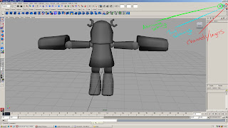

Anyway, the red line shows where the channels/layers box is, the blue is the tool settings, and the green is the attribute settings. For the most part you can ignore the tool settings, just know that it's there if you want to change something about the tool you're using. For example:
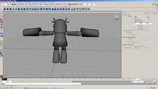

This is what the tool box looks like with the move tool selected. I can change whether I want to move objects with World settings, Object settings, or Normal settings (the only 3 you should care about). I'll get to World and Object later, Normal is good for smoothing out objects after you've added vertices. If there's something weird with your tool or it's not behaving the as expected, just reset the tool and see if that fixes it. Or call Bayonetta so she can punish it like the bad boy it is.

As for the attribute editor, it controls/modifies things that are often far too complicated to care about.
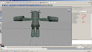

So for the most part you can ignore this, but this is where you find it should you ever need it. If there's something I'm overlooking, I don't remember what it is, but if I remember I'll tell you how useful the attribute editor is and how you're foolish for not using it.

Ok, the main dish is the channels box. The channels box is often split into 3 different areas. You have your channels (red), your inputs (blue) and your layers (green). You can hide and show different aspects of the channels box by pushing one of the buttons above it (yellow). Generally, you want to keep the layout as you see it here.
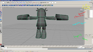

Anyway, let's continue this thing with a simple box. I'll just hide this crappy robot and make a cube. If you look in the inputs box, you'll see something that says "polyCube1". The inputs section basically records what you've done to the object, so if I were to soften the normals on it...
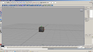

You can see how it is recorded here. The good thing about this is that you can modify your inputs later on (you can delete history to clear inputs). So what's the point of knowing this? Well, clicking on polyCube1 opens up more options for us.
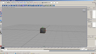

From here we can see that we can modify the subdivisions here as well as the height/width/depth of an object. You can input the numbers you want manually or you can click on the word you want to modify which highlights it in black.
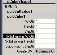

And MMB drag on the viewport to change the values. You see, there's a quick way to do everything. You could do the same thing by creating a primitive, going in the options box, selecting how many divisions you want before making the object then create it. But this way is so much faster and non-destructive it's not even funny (well, a little funny). Note: Doing this after modifying the object (like moving verts, deleting parts, etc) gives weird results.

Anyway, that MMB drag on the viewport thing works for most options that can be highlighted black. There are a lot of commands seemingly hidden in Maya, so it helps to experiment sometimes.

Now for the channels, there's a lot you can do with this but generally for modeling, you don't have to be concerned with much. They become much more important when rigging and animating, and usually those aspects are why you want to freeze transformations. However, if you want to move your object a certain distance or rotate it a certain degree, you can do it here. If you want to undo it, you could just put 0 in all the channels (well, 1 in the scale). Freezing transforms resets all this information, so whatever you did to it before becomes the new normal state. Perhaps you want to hold off on freezing transforms until you're certain about the objects placement and size (that's what she said?), or maybe you don't. I'm not telling you how to model. There are some cool things you can do with this when it comes to flipping models, just add a minus sign to the beginning of the numbers and you can get more changes, but I'll get to that later... maybe.

Finaaaaally, laters. out of everything in the channels/layers box you'll be using this the most. Creating a new layer is easy, just click on this red button or go to Layers > Create Empty Layer.
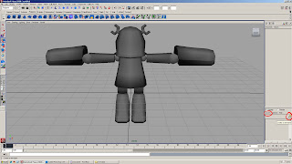

This creates a new layer to which you can add objects to. To do this, select the object, right click on the layer you want to add the object to and select "Add selected objects", it's worded like this because you can add more than one object to the layer. Removing the objects is pretty self-explanatory, it's done the same way, just with another option in the same section (common sense goes a long way). Now that we have an object in our layer, what can we do with them?
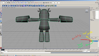

This shows you a few options you have when working with layers. The red part (with the V) shows you the visibility of the layer. Clicking on this hides everything you have in that layer, so it's different than hiding things with CTRL+H. If you hide a layer with a hidden object, the object will stay hidden even after you turn the visibility back on. Essentially this is a different way to hide objects without using the outliner, but do be aware that they both stack (in case you want some super ultra hidden object).

Next to that is the layer mode. Clicking on this once causes a T to enter the box. This is template mode:
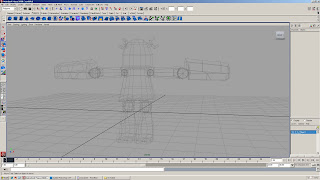

In this mode you'll be able to see a wireframe of your object, potentially allowing you to build around or on top of it. You can't select object in template mode (well, you can with the outliner but...) which makes it useful if there are a lot of things blocking your view but you still need to see them. This save on memory because everything is in wireframe mode and not shaded.

Clicking on the box again causes an R to appear, this is reference mode:
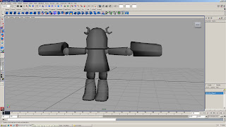

This mode is similar to template, except everything is shaded (so it works with x-ray, textures, lighting etc). The reasons to use this are pretty much the same as template, but most people tend to use this mode. Clicking on the box again causes things to go back to normal.

The final thing next to the template/reference box is the layer colour box, which causes the wireframe on the object to become coloured. This can be used to easily identify which objects are in which layer. To add a layer colours (and incidentally, change the name of the layer) you need to double click on the layer:
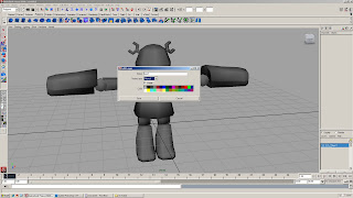

I changed a couple of the colours, but you can see it's easy enough to modify your layer from here. Do note that when naming layers here you need to manually type in the underscores, it doesn't add them automatically like with the outliner. I put on the wireframe from the shading tab.
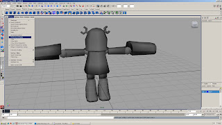


Tip 4: Movements... and stuff.

Knowing how to move objects can be useful when modeling for obvious reasons. Giving specific examples of when would be difficult and troublesome, but once you know you'll find places to use it. Usually the move tool manipulator looks like this:
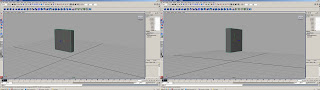

Notice the yellow box at the centre of the manipulator? As you may know, you can move objects by selecting the R/G/B handles (which turns the active handle yellow, keep a note of this) and pushing or pulling the object/vert/whatever along that axis. If you were to click on that yellow box and move stuff around, you would move it according the the position of the camera. However, you can CTRL + left click on one of these handlers to lock that axis. Yeah, I know, complicated words. It's easier for you to understand if you try it. CTRL + left click on the Z handle (blue).
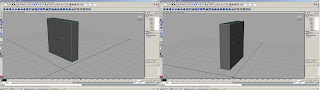

Notice the yellow box now? It's not a square that follows you around any more as you rotate the camera. It's a square that always faced forward, towards the Z axis. If you were to select the box and move it via the yellow box now, you would only move on the X and Y axis, there will be no Z axis movement. You can still move in the Z axis by selecting that handle though. You can do this for the X and Y axis as well. If you want to return the movement to how it was before, you can CTRL + left click on the yellow box.

Sidenote: A quick thing on snapping, and snapping using constraints. If you hold V, you can snap to points. Basically, what this means is that if you have a vertex selected, you can hold V, and MMB drag over another vertex, and the vertex you selected will snap to that position. Now, remember when I said that when you select a handle it turns yellow? If you do that, select a handle direction (preferably one that goes in the direction you want), hold V and MMB drag. Notice how your vertex stays constrained to that axis. Very useful for lining up vertices.

Oh yeah, you can do that point snapping thing to pretty much anything, objects, faces, edges, groups of vertices, whatever. You can also hold X to do some grid snapping.

Moving on.

I mentioned the tool box before, so getting to something about that. The move tool (the only one you really want to change the mode for) has a few different options that are useful.

World mode moves an object according to the world coordinates, so no matter where the object's rotation, the object moves the same.

Object mode moves an object according to the objects rotation. So if you were to rotate an object:
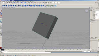
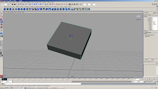

You can move it according to it's rotation. This apples to vertices, edges, etc, so it's useful if you've just rotated an object and want to tweak the vertices on it without the awkwardness that World mode provides. Do note, that if you freeze the transformations of an object (or combine it) most of the things you can do with Object mode disappear. I find it most useful when moving alpha planes to make hair.

That's all for now. Next up, UV'ing for dummies.

Wednesday, 3 March 2010

SIMON!! TAKE IT!!

Here they are finally, Maya life lessons. Maya is God, it brings life into this world and it takes it away. You do not make Maya angry, cause when the 3D Gods are angry, they take away your time, your effort, and your motivation. Maya is cruel and unforgiving, no matter what. The difference is, how fast can you make Maya reach its boiling point? The quicker it spills over, the faster you can get back on track. Eventually, you'll learn how to sacrifice to the 3D Gods, but you can only hold their wrath off for a little while.

Jesus, why the hell did I learn such a scary bitch of a program? Anyway, moving on.

Tip 1: The Shelf.


This is your shelf, the long line that I circled in red. Up here, there are shortcuts to various commands that will make your life easier. Adding commonly used commands here will cut down the time you spend navigating through menus. You may not think it cuts down a lot of time, but it certainly cuts down on strain. 3D work is all about endurance, and this is the best way to not get burnt out.

To add commands to the shelf, all you need to do is highlight a command.


Hold CTRL and SHIFT, then left click on the command you want to add to your shelf.


See how it was added to the end of my shelf? Yes folks, it's THAT easy. If you ever find yourself using a command quite often, do yourself a favour and add it to your damn shelf! There are 3 items you should always have on your shelf.

Delete History (unless you're used to pressing Alt+D)
Freeze Transformations
Centre Pivot

These three alone will help you keep a clean scene. You'll see various other commands on my shelf, another one of my favourite things to have on my shelf is the Multilister (Windows > Rendering Editors > Multilister) or the Hypershader and the Outliner (Windows > Outliner). You'll often be opening both windows very often.

Now, if you want to rearrange a command on your shelf (like move delete history somewhere else), just Middle Mouse Button (MMB) and drag the command across the shelf and move it someplace else. Easy. If you want to delete an item on your shelf, MMB and drag the item over to the trash can (red circle).


So easy, useful and awesome I might just vomit. There, now you know about the shelf. You can also edit your shelf in different ways by left clicking on the little arrow (blue circle). Just go to edit shelf. Alternatively, you can make your own shelf, full of useless crap you think you might need.

Tip 2: USE THE GODDAMN OUTLINER!


I can't stress this enough, the outliner is important for clean, organised and speedy modeling. Especially when doing environments. Do you know where Polycube105 is? No? Well neither do I! In your outliner (you can do it in other places as well, which helps when naming bones), you can name your polygon objects, bones, IKs, clusters, etc so you know what it is you're selecting, you can easily find objects in your scene and most importantly, if you hide something, you know where the object is when you unhide it. It also shows you transforms, deforms and all that crap (protip, those'r usually bad, clean them up).


To access your outliner, go to Windows > Outliner (if you have ADD and skipped over the first tip, go read that and add the outliner to your shelf, like, now).


To rename an object, double click one of the objects in the outliner (for instance, arms) and type. You may think you have to add a dash or underscore when typing, but you can actually just use the spacebar when typing, and the underscores get automatically added! Instead of typing LOOK_AT_ ME, you could just type LOOK AT ME, and when you press enter underscores will have been added.


There, now you know how to rename an object in the outliner (red). You can also rename objects by double clicking the name of the object where the blue circle is. This actually works better when renaming bones, since you can use the Up and Down arrows on your keyboard to move up and down the chain (hierarchy).

Apart from left clicking on objects to select them, you can MMB and drag objects around to change the order of the objects. When you drag, you need to place the object between two others (there'll be a single line), otherwise you might accidentally end up parenting that object to another. If you do parent objects together (or have parented objects in your scene), there'll be a + sign next to your object, click that to open up the hierarchy.


You can then MMB drag the object away and unparent it; you'll be able to reposition the object in the outliner as you please.

You can also hold CTRL and select multiple objects when left clicking, or hold SHIFT and select a long column of objects. It works pretty much like windows explorer, you can figure that much out pretty easily. It's good if you want to select multiple objects to hide or unhide, or perhaps combine, whatever. You can use your imagination to decide what you use it for.

Do note, that I've also showed you how to parent objects via the outliner, which can give more predictable results than randomly selecting 2 objects and hitting P on the keyboard. The parent will always be on top (shown first) and the child(ren) will be beneath the parent. Sounds like some kinda sick joke.

Remember to name your objects often, if you combine or extract your models, you'll need to rename them, you'll also have to clean up your models afterwards. Let's see what happens if we combine two objects together.


See what happens? Those white boxes are usually never any good. This is the first sign your scene is becoming messy and you need to clean it up. I combined the arms object and the joints object together, the end result is the Polysurface1. I need to rename that now. I also need to delete the history.


Now you can see my scene is clean, and I've combined both of the objects together. In short, the outliner is very very useful, you should use it more. It's good for more than I just mentioned, and it's pretty much a necessity when building your own rig. I don't even want to think about rigging without the outliner.

Now, quickly, how to hide and show objects. Simple really, highlight an object and press CTRL+H. It will disappear. This is handy for all sorts of reasons, I won't go into why. But now, you want your object back, but where the hell is it?


Easy, open the outliner. Notice how the hidden objects now have blue names. Highlight them in the outliner and press SHIFT+H. Your objects will now magically reappear! Congratulations, you are wizard.

That's all for now, I'll add a few more things tomorrow. Like um, the inputs channel, layers, and uhh, selection modes.

Sunday, 28 February 2010

Tiny Robot

Now it's time for something that isn't a hate induced rant of rage. Josh wanted us to do a simple 3D model of a tin toy, using only a few tools and a simple diffuse texture. Of course, this feels like going backwards for me, since I've already done this. I've read the book, seen the movie (hated it) and collected all the action figures. I can safely say that I'm over it, but starting out, it's a very useful project to do. Low poly skills are essential for high poly work. Many people don't realize this, eager to jump into Zbrush before they've mastered the basics. Zbrush isn't a miracle program, it doesn't have a "Make look good" button on it like some people seem to think. In fact, Zbrush will ruin your work if you don't know how to use it. Alas, I learned everything the hard way, so I know my words are truth. I know how right I am (forgive the arrogance), but saying these words to people who don't know any better is a waste of time. People need to know that hitting their head on a brick wall hurts, but without a frame of reference or the experience to know that this is the truth. They'll doubt it, question it and inevitably smash their head against the wall only to go, "Yeah, that does hurt."

I once heard a quote, "A smart man makes a mistake, learns from it, and never makes that mistake again. But a wise man finds a smart man and learns from him how to avoid the mistake altogether."

I thought there was more to it, something about a fool constantly making mistakes and not learning from them. But I urge people listening or reading, even if they don't care (I often don't) to be a wise man.

Anyway, my Robot is called... well, Tiny Robot. It's a small tin robot, patched up and made by a small boy who wanted nothing more than a friend. His wishes came true one day when the robot came to life and started moving. It was only made out of tin at this point, it was worn out and rusted, so the boy wanted to paint over it, but didn't get a chance to finish. I want to show this in the texture, I want it to be half tin and half painted. A 50/50 split between clean textures (somewhat) on a dirty, raw material. ENOUGH TALK! Pictures.


Textures are still unfinished, I've only begun to start detailing. Sooner or later, I'll get to making some Maya life lessons for John.

Alright, so there's this thing... (Cynical Blog Post 3)

That I never realized. The rule of three. Twice is too little and four times is too much. I won't go to far into the details, because Steve already covered it. Suffice to say, I do think that three is the magic number, just don't let your players know it.

Another thing I never realized, is the art and design split. I used to think that art and design could meld together, into some crazy blob of awesomeness. Turns out this wasn't the case, and while I bounce back and forth between art and design, this week I'm in the design camp. Let's talk about art.

Joanna Mowbray - Sculptures

Now, I rolled into this lecture as usual (30 minutes late, not regretting a thing, usually with some snickers). But this day, I had been constantly (and accidentally) putting my alarm on snooze. It was bad luck that my wake up alarm had gone off the exact same time as I entered the lecture. My alarm was set for 8:50, how I managed to not turn it off until 10:30 is beyond me. As I sat down, I noticed sticks in the ground. Yep, just sticks. The first thing I saw was Joanna's... something in space. Sticks in space? I forgot what it was called. But she said it was basically her outlining something; it was around there somewhere, but she never showed us.

Anyway, this woman was an artist. No two ways around it. She worked instinctively and freely flowed from thought to concept. She worked on paper (and with paper) for the ease of manipulation, then later used stronger materials to make her work last and stand up. The metals she used were dependant on what she wanted to do. One of her works was near the sea, so she used copper so that the rust would create unique patterns. Some of them she used stainless steel because it's very strong and clean, so it could reflect light well. Some she used bronze (I think) so that when the light hit it, it would create a nice orange/brown shadow underneath.

Her sketches were fantastic, lovely use of shape, perspective and shade. I wish she had kept her ideas there, because a lot I felt was lost between the page and the product. She prefers to work on her own stuff at all times, but will hand her projects over to people and supervise them if the work because too large or heavy for her to handle. She felt like an artist comes into constraints later on; she misunderstood the question that was asked of her. Since the constraints and limits she referred to were the ones that you place upon yourself, rather than what anyone else places on you. A lot of her work was circular, old designs would come back around, perhaps an accident or simply refinement. However, in my cynical eyes she just ran out of ideas. A lot of the work just looked like her previous work, and while I have no problem with revisiting old ideas and concepts to make them better - I saw no evidence that anything was being changed. Perhaps that is my inexperience as a sculptor talking (Yeah, Zbrush doesn't count, even though it should), but I thought there would be more to change. The shape was the same, the little hole in the middle was the same - oh, she just changed the colour - it's still the same. One thing I give her credit for though, was that her work had some awesome names. Let me list a few for you:

The Spaces Within
Movement in Space
Blades
Encompass
Abyss and Passages (?!)
Beyond and Within
So Far So Near (So Near yet So Far)
Surface Tension

Reading this, you're probably thinking how corny they all are. Well, they are corny, but only as words, when you see the work, they lose all sense of corniness. Abyss and Passages could be summed up as... a funnel. One piece of work she had walnuts and light bulbs (I think, definitely light bulbs) on a wall. She talked about relationships and how we don't think about how certain objects relate to each other. Someone asked what the relationship between them was; when pressed further, she simply said, "The relationship between them is exploring the relationship." I was taken aback, I'm paraphrasing here, but the quote isn't far off. It took all my energy to not burst out laughing as I thought, "So there is no relationship then," and shook my head.

I'm still amazed at this whole art vs design thing. There was a lot of talk about feelings and taking your concept in places you never imagined - which I agree with, they are all important aspects, but this seemed too random. It seldom made any sense, but I applaud her conviction. If there's nothing I like about the concept or the way it turns out, I respect how it was made. Working with metal isn't easy, and the jump from 2D to 3D is a harsh one.

Gotta get 100 words out of this... how do I distill cynicism into academia? Is there anything I can take away from this as a game designer?

...
...
...

Saturday, 13 February 2010

Cynical Obligatory Blog Post 2 - Nevar Forget

The title tells more than it should. This post is basically a way for me to "never forget" what has happened. It's not a reference to some horrible war or event I took place in-- well actually it is. Friday morning lectures are a war. A war against boredom and apathy. There's only so much you can care about lighting, enamelling, leather working (HAH) or fine art (ew). And to say that I care, even a little bit, is completely wrong. Someone said there was a point for us Game Design students. But hell if I can remember it, I probably wasn't even there when they told us what it was. But I can say for certain they were talking out of their asses.

I have a lot (well not a lot, a little bit) of respect for those who can find the joy and the upside to these lectures. There's the whole thing about cultural enlightenment, or some crap like that. Broadening your horizons and that you can't stay cooped up in your little box. I disagree, keep me in that box, I like the box and I like the darkness. If pressed, I could say that I took something away from all of those lectures, that each one shaped and molded me as a person and now I'm better off because of it. Hah, only someone as arrogant as I sound right now would think that their lectures had so much impact it was like watching the death of Christ. The stuff that I can take away from these lectures, are the things you would (or at least I would) think about when you're pressed against the subject. You would think about fashion when designing the character's clothes, you would think about lighting when creating lights and lighting a scene, you would think about enamelling when... making accessories? You would think about leather working... I guess... I wouldn't really, nor would I think about fine art. But still, everything you could take away from these lectures are to do with the person's experience in that subject, which is good for people who study that subject. But it has absolutely nothing to do with me. I don't need to know, nor do I care that the speaker hates working in the industry, I don't care if they went to Australia for 6 months, avoided being killed by everything and came back like the second coming of Christ (Jesus, a lot of Christ). For the most part, I'm looking to take notes, write this essay and move on. Perhaps I'll be entertained along the way, perhaps sooner or later I'll actually take something away from all this (apart from avoiding lectures at all costs) and perhaps I'll look at this blog post and shake my head disapprovingly.

Anyway, first guy.

Craig Atkinson - Fine Art

The fine artist. At least, that's what I call him. Since I was technically at this lecture, I'll write about it. If there's a word to describe this man, it's random. He does things for the sake of doing them and looks at the result with approval or disappointment. He seemed rather...immature in his way of creating things, the sort of attitude that suggests that if he drew a moustache on the Mona Lisa he'd go "yeah, I like that." I know Fine Art has nothing to do with actual drawing ability (something I consider to be stupid), but... it seems like he doesn't even try, or doesn't try so no one can tell him that he did a bad job even though he tried his hardest. This to me, screams weakness, someone who can't take the harsh truth of their work being bad despite them pouring their heart and soul into it. I see nothing of the sort, nothing that suggests he tried and moved on despite failure and was better for it. I hate this style of fine art, where everything has this alleged deeper meaning that you have to strain yourself to find. He felt like he was constricted by the limitations that the industry or gallery put on him, I think he was just constricted by the inability to actually do something worthwhile.

I think the limitations imposed on a person helps to shape them, give direction and focus and really test creativity. It's not always fun, or easy, but it is satisfying. He would imply that working for anyone other than yourself is just a safety net for those who don't want to venture out in the dangers of the world, which I think is complete crap. Working together with people will always help more than harm, even as an artist, you can't get good if you have no one else to look at your work and tell you things that you missed completely. If I have to get positive about this guy, I suppose it's his lateral thinking. Moving from point to point, thought to thought instinctively and keeping everything very open and flowing. Kudos to him for making it in this big bad world.

I suppose later on I'll distill the cynicism into something more academic. But I'd really have nothing to say if I took that out.

Ruth Ball - Enamelling

I thought this was a welcome change from the week before. Ruth had been working for around 20 years, and the nature of her work evolved from common student dribble (pretty dribble, though) to something marketable and usable by the general population. She works very methodically, but still manages to make things in a creative and free manner. Her work (as one would expect it to be) is intricate, with the many layers and techniques of enamel working together to create a piece of jewelry. She goes from hard patterns to soft painterly strokes in her work. The variety of colours and patterns work well together to draw the eye. She is someone who feels that the exploration of technique can influence the work, I suppose that means that experimentation is good every so often and that one shouldn't stick to the same tried and tested formula for their field. She fuses techniques to create new pieces of work, something I often try to do as well, so it was interesting to see how another field of design handles it. She has worked for the industry in galleries and has had commissioned work, but she feels that it is possible to find meaning and creativity within the limits imposed. This turned out to be a common aspect, as so far most people who have worked within limitations feel like that.

She moved from small pieces of jewelry to rather large pieces of art. Large panels, boxes and other wall-fixtures that she used the same process on. She seemed to enjoy doing that, finding the boundary of how big her work could be. She also mentioned that she found the unpredictable nature of enamel work appealing and (from what I gathered) a little frustrating. As there's no way to know what happens when you light your work on fire, sometimes the results are less than desirable, or completely desirable but not what you expected.

Lamp Girl - Lighting Design

I don't have her name... Actually I should find that. Oh, it's Claire Norcross. So, Claire's work was all about lighting, something which sounded incredibly dull to me, but somehow was more interesting than I gave it credit for. One thing I noticed - which is something I agree with and found that Craig disagreed with - is that design is a social activity. People add to a design and take away from it. Is this a difference between "designers" and "artists"? I find myself straddling the line, but it's weird to see how my perception of artists is one of selfishness. They want to do what they want and no one can tell them differently. While designers are all about sharing, bouncing ideas off each other to refine it, or gain more ideas. A generalization of course, so if you're an artist don't think I'm calling you selfish (I am, though).

Anyway, Claire had a lot of weird and quirky ideas, but she saw them through and the end result was pleasing to look at (though not entirely practical). She was influenced by nature and her designs reflected that. I think that nature is aesthetically the best place to go for design, as the shapes, patterns and colours are so pure and untainted that you can often integrate those into your work to find something pleasing. The thing I liked most was the star light, which opened up into a lot of little stars and the light passing through created some nice shadow. It wasn't much of a light, but it was pretty. Claire seemed most interested in origami, the art of Japanese paper folding, in order to make her lights. She worked with a lot of different disciplines and moved around the world, which seemed to influence her work. But mostly, just seemed to be where the next job took her. She was looking at public art, finding it interesting to share your work with the general public in the forms of vandalising building by stringing them up with lights, or having weird floor panels that turn lights on and off. Claire found it hard to work alone, and as I said before, liked having more people around to do research with and find new designs. She viewed this as a distillation of design until she got to the final outcome. She often had to work on time constraints, saying that her work would have been better if she had more time - but she knew she would never have the amount of time that she wanted, so she had to make her work as good as possible within the limits.

Barry Purves (Yes, Purves) - Animation

Now, this guy had passion. I mean, the other lecturers talked about their work, this guy felt it. Everything he said had such passion and fire in it, you believed everything he said and often wanted to hear more (until the dull Q/A section with stupid questions). Animation is something I'm interested in, so it was good to see other techniques and limitations of traditional methods. 3D animation is very free-flowing, you can modify the frames (timing), you always have a consistent look and you can view your animation from many different angles easily. Barry seemed to look down on CG animation, saying that 2D animation and stop-motion animation had more feeling to them. I disagreed with this, and with most of his views on CG, but I saw his point of view. He liked the feeling of doing things in the moment. He described how that in stop-motion, if a character is doing a gesture they can't complete due to limitations (the cloth stretching, restricting movements), you had to improvise and turn that gesture into something else completely. 2D and stop-motion had to be perfect from the get-go, everything you did couldn't be changed or modified later on down the road (save from cutting it out completely). Barry liked the strings and mechanics behind animation, how seeing the operator(s) of a puppet could bring things to life. He told a story of Warhorse, a play about a boy in WW1 who went looking for his horse after his father sold it to the army. There was a part where the boy had to kill a horse dying from mustard gas and stabbed it in the ear. The operators of the puppet horse got out of it, bowed to the horse and slowly sunk into the shadows. I thought that was a really good way to infuse emotion into a piece. Even the operators of this horse showed such care and respect for a puppet and a fictional story character, the audience couldn't help but be moved to tears. He said that theater was made for the audience, how their laughter, cries and coughs influenced the way the actors worked. Something you wouldn't get from cinema. Barry's work - Screenplay - used this element a lot, people dressed in black (that you could clearly see, but obviously weren't supposed to see) using all these stage effects right in front of your eyes.

Barry was the first one to actually say, and give the feeling that he loved working in limitations. One of his works, a Shakespeare retelling only had 1 puppet, but thanks to this he came up with a great concept and piece of work to utilize that puppet, and the final piece of work was perhaps better off for it than if he had 3 or 5 or 10 puppets to use. This work was based on body language, something that every animator needs to know, even artists too. Body language can say more than words (especially if you watch Lie to Me). Barry liked to be spontaneous due to the limitations and was often aware (and made us aware) of the techniques behind his work. Barry gave a few pointers to wanna-be animators. Things like, how timing is important and how you should always show your thought process and be clear with your concepts. How your animations should always read clearly, and how important show and don't tell is (duh).

He showed us a few interesting short movies (along with his own mentioned above). One about a dead puppeteer being moved by alive puppets, one about a boyfriend and girlfriend (Polar Bear and Penguin) having an ordinary conversation about something the boyfriend did wrong (obviously, it's always the boys fault). The last one about knowing your place, and how people do their jobs with their entire bodies and often pay with them.

The one thing I distinctly remember thinking by the end of this lecture was that; animators are messed up. I wouldn't like to meet one of them (or their concepts) in a dark alley. That's for sure.

-----

Whew, that was long. Note to self: Do this crap sooner rather than later, so you don't have to retell 4 weeks of lectures in a single sitting.